Every business needs a powerful visual identity, and bookstores and independent publishers are no exception. A well-designed logo can elevate a brand, communicate its values, and resonate with target audiences. Whether launching a new literary venture or refreshing an existing look, having the right logo is essential for standing out in a competitive market.
TL;DR
Choosing the right logo is crucial for bookstores and indie publishers aiming to build brand recognition. This article explores 12 creative logo ideas that reflect literary themes, visual aesthetics, and the storytelling spirit. From minimalist book stacks to whimsical quills, there’s an option for every style and mission. Read on to explore logo inspirations that make your brand memorable and meaningful.
1. Classic Book Stack
One of the most recognizable symbols for any bookstore or publisher is, of course, the book itself. A stacked arrangement of books can create a clean, symmetrical logo that exudes tradition and trust. Pair this with muted vintage colors for a timeless feel.
This style suits bookstores that focus on classics, academic texts, or rare finds. The image of stacked books is synonymous with knowledge and depth, making it a solid choice for brands with educational or historical themes.

2. Quill and Ink
For indie publishers or bookstores interested in evoking a sense of heritage and creativity, a quill and inkwell logo may be the perfect fit. This style nods to the traditional world of writing and represents storytelling at its purest.
Choose elegant line art or a vintage sketch to keep the design light but still impactful. It’s an homage to the past that communicates authenticity and craftsmanship.
3. Modern Typography
In some cases, less is more. A typography-based logo using custom or curated fonts can convey elegance, modernity, and clarity. The right typeface can speak volumes about your brand ethos.
This style works well for minimalist bookstores or publishers focused on contemporary literature, poetry, or experimental work. Try sans-serif fonts for edgy appeal or serif fonts for a polished, professional look.
4. Abstract Open Book
For those seeking a sleek, contemporary design, consider an abstract depiction of an open book. When stylized creatively, this symbol can appear as wings, a heart, or waves, adding multiple layers of meaning to your logo.
This is ideal for businesses that emphasize imagination, transformation, or exploration through reading and writing. The abstract format makes it highly versatile for both digital and print media.

5. Candle or Lantern Motif
A light source such as a candle or lantern is a powerful symbol of knowledge, discovery, and enlightenment—core themes in any literary pursuit. A candle motif can add a warm, inviting tone to the overall brand image.
Used sparingly in the design, it integrates well into stylized logos for publishers pursuing inspirational or spiritual books, as well as indie bookstores with a cozy aesthetic.
6. Shelving Silhouettes
Incorporating a silhouette or outline of bookshelves creates immediate recognition. This is a natural choice for community bookstores that want to emphasize comfort, familiarity, and abundance.
You can experiment with curved lines, geometric shelves, or even a recognizable furniture piece like a ladder-style shelf with books and plants to build visual warmth into your logo.
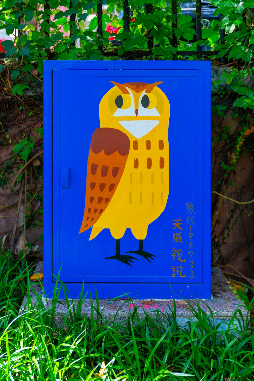
7. Animal Mascot with a Book
Adding personality through a mascot is a sure-fire way to appeal to younger readers or niche audiences. Think owls, foxes, or even mythical creatures reading a book or perched on a stack.
This playful approach is especially effective for children’s bookstores or indie publishers catering to fantasy, folklore, or YA fiction. It delivers a strong emotional connection and makes the logo instantly shareable.
8. Celestial Symbols
Stars, moons, and constellations are constant companions in the literary world, from poetry to science fiction. Integrating these celestial elements into your logo can create an aspirational or dreamy identity.
This idea suits publishers exploring diverse genres or bookstores curating mystical or thought-provoking selections. Pair celestial symbols with handwritten fonts or deep colors for maximum effect.
9. Typewriter Elements
A vintage typewriter key, platen roller, or even a stylized paper sheet can invoke nostalgia and a focus on writing. Use of such iconography connects directly with the publishing process and the writer’s journey.
Ideal for independent publishers or brands that work closely with authors, this design can add an analog feel and celebrate the art of editing and creating manuscripts.
10. Tree of Knowledge
Often found in mythology and literature, the tree symbolizes growth, knowledge, and life. Designed creatively with books as leaves or branches, it can serve as a deeply symbolic yet subtle logo icon.
This works well for bookstores and publishers with educational missions, civic engagement goals, or nature-focused collections. The tree blends beauty with purpose in a timeless visual expression.
11. Personalized Monogram
For small or boutique publishing houses, a refined monogram using initials can suggest luxury, individuality, and meticulous attention to detail. Incorporate literary details like ink splashes or small book outlines into the letterforms for added character.
Monogram logos allow for flexibility in branding across book spines, bookmarks, and merchandise without losing identity.
12. Hidden Symbols
For a more artistic touch, consider logos that reveal subtle literary references upon closer look—perhaps letters hidden inside a quill’s swirls or tiny books forming other objects. These “Easter egg” designs make the viewer pause and look again.
This approach doesn’t just represent what the brand is, but how it operates—intelligent, layered, and rewarding closer attention. It’s an invitation to read more deeply.
Final Thoughts
Choosing the right logo for a bookstore or independent publisher is much more than a design task—it’s about defining your brand’s story, mission, and voice. With the right imagery, symbols, and typography, a logo can become an enduring mark of creativity and cultural contribution.
FAQs
-
Q: What elements should a bookstore logo always include?
A: While it’s not mandatory to include a book or reading symbol, most bookstore logos benefit from including literary icons, clean typography, or a nod to the written word to ensure brand clarity. -
Q: How important is color in literary logos?
A: Color plays a crucial role in evoking emotion and setting the tone. Earthy tones communicate warmth and tradition, while bold colors suggest creativity or innovation. -
Q: Can logo symbols be copyrighted or trademarked?
A: Yes, as long as the logo is unique and serves as a brand identifier, it can typically be trademarked for legal protection. Avoid generic icons used widely in the public domain. -
Q: Should our logo look good on both books and digital platforms?
A: Absolutely. Your logo should be scalable and legible from small formats like website favicons to larger prints like banners or bookshelves. -
Q: How often should a bookstore or publisher refresh its logo?
A: Refreshes depend on your brand strategy, but generally, updating your logo every 5–10 years keeps the look current while preserving brand recognition.