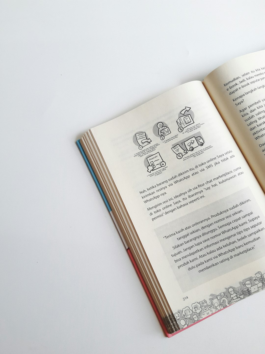
A well-designed logo is more than just a visual mark; it’s a symbol of identity, trust, and professionalism. For bookstores and independent publishers, the logo is often the first impression a reader or buyer forms of the brand. Whether it’s printed on a spine, a webpage, or a tote bag, that logo speaks volumes about the business’s personality and mission.
TLDR: Your bookstore or indie publishing house needs a memorable logo that captures your brand’s essence. In this article, we explore 12 creative and professional logo ideas to help you stand out, build trust with your audience, and reflect your core values. Whether you focus on classic literature or cutting-edge indie voices, we cover styles both modern and timeless. Get inspired to create visual branding that opens the next chapter for your business.
1. The Classic Book Emblem
One of the most timeless logo motifs for bookstores and publishers is an image of an open book. This instantly communicates your industry while evoking feelings of knowledge, imagination, and escape.
- Design Tip: Opt for minimal line art to keep the logo versatile and scalable across formats.
- Brand Fit: Traditional bookstores with a curated selection of literature or academic titles.

2. Quill and Ink Symbolism
This elegant logo idea relies on heritage cues—perfect for publishers of literary fiction or history titles. Quills and ink evoke a pre-digital romanticism aligned with storytelling traditions.
- Design Tip: Pair with serif fonts for a vintage feel.
- Brand Fit: Historical publishers, classic literature outlets, or poetic imprints.
3. Monogram Logos
For a sophisticated and corporate-style appearance, consider a simple monogram logo—typically the initials of your brand name stylized uniquely.
- Design Tip: Focus on symmetry and negative space to keep the logo clean but compelling.
- Brand Fit: Independent publishers aiming for a professional, versatile look across print and digital formats.
4. Typography-Centric Designs
Sometimes letters can speak louder than symbols. A typography-focused logo makes art out of your business name, using custom serif or sans-serif lettering to set the tone.
- Design Tip: Work with a type designer to create a truly custom logotype.
- Brand Fit: Bookstores and publishers with a modern or minimalist identity.
5. Stacked Books Icons
Visually representing a stack of books in your logo sparks immediate recognition. It’s especially useful for bookstores where volume and physical stock are still defining elements.
- Design Tip: Combine geometric shapes and warm earth tones for a cozy, welcoming feel.
- Brand Fit: Community bookstores, second-hand bookshops, and local retail chains.

6. Celestial or Mythological Motifs
Books are gateways to the unknown—a concept perfectly represented by stars, moons, or mythological creatures like phoenixes or owls. These can add a layer of symbolic depth to your logo.
- Design Tip: Use restrained gradients and simplified silhouettes to keep the logo readable.
- Brand Fit: Sci-fi and fantasy publishers, or bookstores with thematic curation.
7. Minimalist Line Art
For a contemporary feel, consider a logo drawn entirely from a few delicate strokes. Minimalist line art brings a Scandinavian design ethos that appeals to modern, design-conscious readers.
- Design Tip: Stick to black and white or neutral palettes for enhanced versatility.
- Brand Fit: Art book publishers, boutique bookstores, or zine distributors.
8. Nature-Inspired Imagery
As books are often associated with tranquility and reflection, nature elements like trees, leaves, or roots make a logical and emotional connection. The tree of knowledge is a popular variation of this motif.
- Design Tip: Consider combining a tree or leaf with a hidden book shape in the trunk or branches.
- Brand Fit: Independent, eco-conscious publishers and rural or wellness-themed bookstores.
9. Vintage Press Icons
Gutenberg-style printing presses and type blocks root your logo in the heritage of print. This design direction nods to tradition and the tactile nature of printed literature.
- Design Tip: Add a subtle texture to evoke print surfaces like paper or clothbound covers.
- Brand Fit: Publishers specializing in limited-edition or hand-bound books.
10. Abstract Marks
If your brand is avant-garde or genre-crossing, consider an abstract logo. These often require a bit more brand equity to be truly effective but can set you apart quickly.
- Design Tip: Integrate motion or asymmetry for a dynamic feel.
- Brand Fit: Progressive literature publishers, hybrid booksellers, or cross-media ventures.
11. Animal Mascots
Using an animal as a brand mascot is a great way to humanize your bookstore or publishing house. Owls, foxes, or cats are popular for their associations with wisdom or literary culture.
- Design Tip: Stylize the animal so it looks unique to your brand—not generic clip art.
- Brand Fit: Children’s book publishers, cozy bookshops, or narrative-driven brands.
12. Book + Object Hybrid Logos
A compelling way to tell your story in a simple symbol is to blend a book with another object—like a globe, a candle, or a key. These represent the themes of discovery, knowledge, and illumination.
- Design Tip: Keep the composition balanced to ensure the resulting icon remains legible.
- Brand Fit: Educational publishers, specialty bookstores, or philosophical imprints.

Final Thoughts
A great logo is more than just aesthetics—it’s a visual ambassador for your story. For bookstores and publishers alike, it must strike a balance between individuality, clarity, and emotional resonance. Whether you’re drawing from classic iconography or pushing creative boundaries with an abstract mark, your logo should be a visual summary of your brand’s mission and soul.
Before committing, always test your design across various formats—business cards, bookmarks, spines, and mobile screens. And remember: the best logos for bookstores and publishers not only sell books—they invite readers into a world worth exploring.
