When you’re starting a new bookstore or launching an independent publishing house, one of the first elements that defines your brand is your logo. A logo serves as the visual identity of your business, and for entities in the literary world, it carries even more weight—it needs to evoke creativity, intellect, and imagination. With the right logo, your brand can not only attract readers but also convey trust and professionalism to authors, partners, and customers alike.
TL;DR
This article explores a variety of logo ideas tailored specifically for bookstores and independent publishers. From minimalist typographic designs to clever combinations of books and animals, each concept is suited to evoke the right emotional tone for your brand. You’ll get inspiration from classic motifs like open books or ink pens, as well as fresh ideas like abstract symbols and modern color palettes. Whether you’re going for vintage charm or contemporary flair, there’s something here to inspire your next creative project.
1. Classic Open Book Symbol
Few visuals communicate ‘bookstore’ as clearly as the image of an open book. This classic icon can be stylized in countless ways—from sharp, clean lines to a more hand-drawn, vintage look. The open book instantly signals reading, storytelling, and knowledge. It’s a perfect starting point for a timeless, flexible logo design.
Tip: Try incorporating your brand initials into the pages for a stylish, integrated look.

2. Quill and Ink
For a more old-fashioned or nostalgic feel, few images beat the quill and inkpot combo. This is a great choice for publishers who want to reflect the heritage and tradition of the printed word. It lends itself well to elegant serif typefaces and warm color palettes like sepia, slate gray, or deep navy.
Best for: Historical fiction publishers or antique-themed bookstores.
3. Monogram with a Literary Twist
Monogram logos are fantastic for creating a sleek, high-end look. For bookstores and publishers, you can add thematic flair by playing with the typography—like using book spines or stacked text to create the-letter forms. This routes your logo toward luxury and sophistication while keeping it relevant to the written word.
Design idea: Use a stylized “P” and “B” for “Publishing Books” merged into the shape of a book cover.
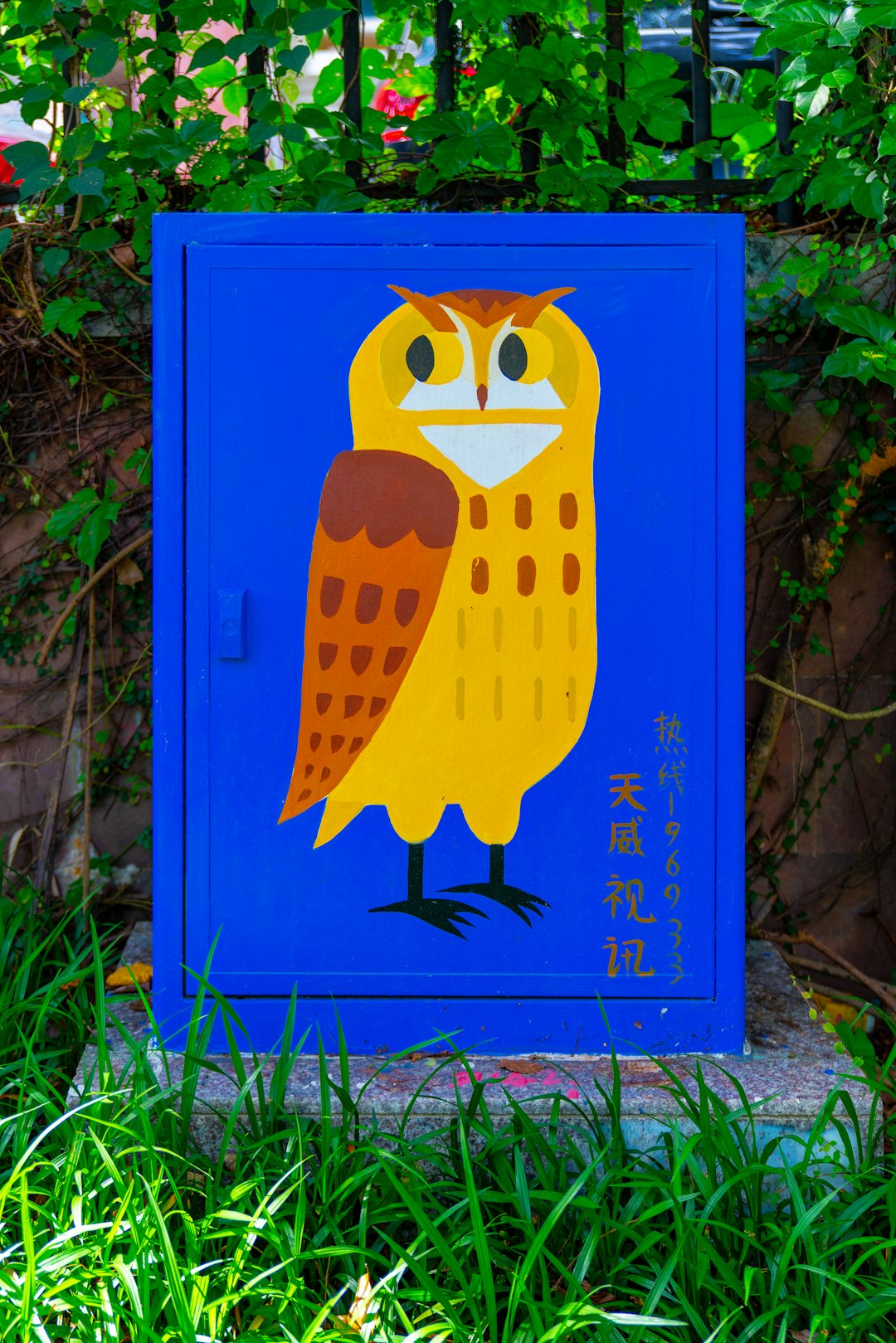
4. Animal Mascot with Book Elements
A charming way to humanize your brand is by introducing an animal mascot. Think owls with eyeglasses, foxes reading books, or cats lounging atop bookshelves. These logos are especially engaging for indie children’s book publishers or community bookstores with a cozy, welcoming ambience.
Fun choice: Combine animals and books in a whimsical, hand-drawn style to make an inviting family-friendly logo.
5. Minimal Line Art
Calling all modernists—minimalist line drawings are clean, trendy, and refreshingly simple. Outline a book, a stack of pages, or even a reader in a chair. This is a good direction if your brand embraces a sleek, architectural aesthetic and targets design-savvy readers.
Pro tip: Use black and white as your base palette, with a single accent color like burnt orange or sage green to add dimension.
6. Library Shelf Silhouette
Another great visual cue is the bookshelf. Think of it as a horizontal or vertical logo with books neatly aligned or even slightly chaotic for a bohemian flair. This works beautifully for second-hand bookstores or publishers dealing in collections and anthologies.
Design angle: The shape of the bookshelf can double as a letterform in your company name for added impact.
7. Collage Style Logos
Layered logos that combine a variety of elements—a typewriter, a coffee cup, pens, and stacked novels—can tell a richer story. This logo style is ideal for creative hubs that double as event spaces or cafés. It showcases the multidimensional offerings your brand provides.
Best suited for: Independent bookstores with a strong community and cultural engagement.
8. Typography-Driven Design
Sometimes, less is more—and a typographically-focused logo proves just that. Choosing the right font and arranging your text inventively offers both aesthetic appeal and brand clarity. Vintage typewriter fonts, handwritten scripts, or modern sans-serifs can all evoke unique emotions aligned with your mission.
Wordplay hint: Fashion your name into the shape of a book or quill for added interest without adding images.
9. Hidden Symbols
Hidden or dual-meaning symbols make for incredibly memorable logos. Consider building a logo that at first glance looks like a book—but with negative space that reveals a pen nib or a reader silhouette. These cleverly embedded meanings create intrigue and memorability for your audience.
Example: A stack of books with the center cut out to form a candle flame—symbolizing illumination.
10. Retro Stamp or Seal Look
Vintage-style seals or rubber-stamp designs give your logo authenticity and a rustic charm. They’re especially loved by indie publishers producing limited releases or bookstores known for rare and collectible editions. These designs work well both digitally and in print merchandise like bookmarks or tote bags.
Variation idea: Include establishment dates, registration numbers, or Latin phrases for a scholarly look.
11. Abstract Symbols
Who says your logo has to be literal? Abstract marks that suggest but don’t show books or writing tools can set your brand apart. Think of spirals (suggesting storytelling), upward arrows (growth and knowledge), or minimalist crowns (reigning over literature).
Appeal: These logos are perfect for edgy, modern publishers aiming at a broad digital audience.
12. Seasonal or Genre Variants
Some logos are designed with modular variations—you can use distinct symbols or colors for different book genres, seasons, or business divisions. This approach allows for dynamic branding while keeping a consistent identity. For example, you might have a base logo of an open book, and change the background scene from a snowy window to blooming flowers as the seasons change.
Use case: Perfect for subscription-based publishers or multi-genre bookstores.
Final Thoughts
Creating a great logo for your bookstore or publishing endeavor doesn’t require a massive budget—it just needs creativity and a deep understanding of your audience. Whether you want to communicate tradition, originality, intelligence, or warmth, these 12 ideas cover a wide spectrum of design possibilities. Take inspiration from motifs that reflect your mission, your readers, and your publishing persona.
As you design or commission your logo, remember this: the best logos stand the test of time not just because they look good, but because they tell a story. And who better to tell stories than those who live and breathe books?
Now, grab a sketchpad or open up your favorite design software—it’s time to bring your literary brand to life.