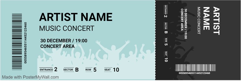
Presentation is key when it comes to designing any kind of printed material for your event, be it posters, flyers, tickets, etc. You need to ensure they all look top-notch, especially tickets. Tickets are often overlooked as something impressionable. However, they can influence the overall perception of your concert.
People often keep concert tickets as mementos of the time they spent and the experience they had. If your ticket is well-designed, then it will help in recalling a positive experience. But how does one design such a ticket? There are some basics of designing an impressionable concert ticket; certain things that need to be taken care of while you are designing your ticket. We will discuss them today.

Select A Background
One of the first things you need to do while designing a concert ticket is to decide on a background. You want something that is simple and doesn’t overwhelm the viewer. A high contrasting option, between the background and the text, will be best here. Instead of searching for backgrounds manually, you can use PosterMyWall and their ticket templates. These have the background already added to the design, so you will only need to select one and get straight to editing.
This will save you time and energy which can be utilized elsewhere. The template will also have some basic text added as well which you can tweak accordingly. Once done, you may then download and send it for print.
The example below shows such a highly contrasting background. Notice how it compliments the text and makes it easily readable even at a certain distance. You can try a similar high-contrast color combination for your ticket as well. The key is to make your ticket easily readable so any combination that achieves this function will work.

Font Choice
Next, you will need to choose the font that will go on your ticket. This depends on the kind of concert you will be holding and what artists would be performing. The more casual the performance, the more funky your font choice will be. Similarly the more formal the acts, such as Jazz or Classical, the more neutral or business-like your fonts will be.
This helps set the tone and expectation for what the audience can be in for at the concert. Even if a person is completely unfamiliar with the concert and the artists performing at it, they can look at the ticket and know what to expect. Also, ensure that the font is easily readable, even at a distance. To help, you may choose highly contrasting colors between the font and background.
Artist Logos
There are marketing and print materials on which you can show off your graphics designing ability, the ticket is not one of them. Since the total printed area is small, you need to be economical with the information you put on it. By using the artists’ logos, you can say a lot in a few words. Logos are a form of brand identity and as such will make your artist lineup easily identifiable. You want to ensure that anyone who looks at your ticket clearly knows what and whom the concert is about.
If you have multiple acts then limit yourself to 3 of your main artists. You don’t want to clutter the ticket up since there will already be plenty of text on it related to the seating and venue. Less is more so make sure not to go overboard and keep things on the simpler end. Your ticket should have artist information, venue, date and time, and seating information. So plan accordingly how to put this on the ticket.
Other Applications Of Your Ticket Design
When you have the design for your ticket down, you may also use it for other purposes as well. For example, with some tweaking, you can convert it into a social media post, poster, or even a flyer. You may keep the basic design from the ticket but with the added room, you can include far more elements and text and use it elsewhere.
If that doesn’t strike your fancy and you want to create something else from scratch, you may check out PosterMyWall’s concert flyer templates. They have similar designs as tickets and you may even port your ticket design elements over here too. The choice ultimately is yours as both ways can work and do the job.
By using the techniques and strategies above, you can design a great ticket for your concert that leaves a lasting impression. Of course, every ticket and its design elements will be different, but the crux of designing will be the same. Start with the background, add the text with an appropriate font, add the logo and other design elements, and you’ll get your ticket made in a matter of minutes.
