Most coaches, consultants, and personal brands understand that a strong logo isn’t just decoration—it’s identity. Your logo is often the first impression, the lasting image that defines who you are, what you offer, and what you stand for in a highly competitive industry. Whether you’re a life coach hoping to inspire transformation or a business consultant aiming to exude trust and professionalism, having the right logo can help you communicate your essence at a glance.
TLDR:
Looking for the perfect logo for your coaching or consulting brand? This article shares 11 creative logo ideas to inspire bold branding decisions. From minimalist icons to signature-style fonts and symbolism-rich visuals, there’s something here to align with any personality or practice. Ideal for coaches, consultants, and personal brands who want to make a memorable impression.
1. Minimalist Wordmark
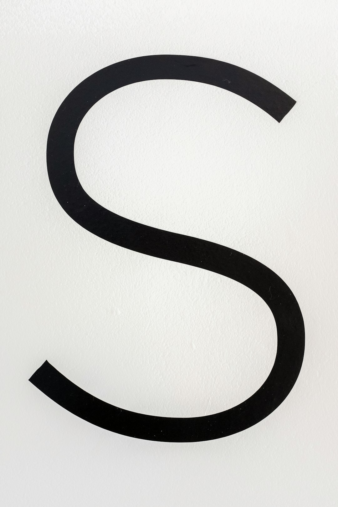
Sometimes, less truly is more. A minimalist wordmark uses your name or brand name in a clean, modern font without icons or illustrations. This style works best for personal brands and consultants who want an elegant, understated look that focuses on the power of the name itself.
Why it works: Easy to remember, scalable, and professional. Great for simple brand applications like social media, websites, and business cards.
2. Signature Style
By mimicking handwriting or using a stylized script font, signature-style logos bring a personal, human element to your brand. Perfect for life coaches or wellness consultants who rely on authenticity and personal connection.
Why it works: Feels warm, approachable, and custom-made. Makes clients feel they’re getting a personal touch.

3. Abstract Symbol
An abstract shape or symbol can represent your brand values or services without being literally descriptive. This is popular among leadership and business consultants who want a timeless, scalable brand asset that doesn’t pigeonhole them to a single niche.
Why it works: Creates intrigue and memorability, while also suggesting innovation and flexibility.
4. Initial-Based Design
Using your initials in a stylized form can give your logo a professional and corporate feel without being overly complex. This approach works especially well for executive coaches and B2B consultants.
Why it works: Clean, clear, and perfect for branding merchandise, folders, and digital collateral.
5. Symbolic Imagery
Building your logo around a symbol—like a tree (growth), compass (direction), or lightbulb (ideas)—can effectively tell your brand story. This is particularly engaging for transformational coaches and spiritual consultants.
Why it works: Instantly communicates a key brand attribute. Symbolism is powerful and enriched with meaning.

6. Monogram & Icon Combination
This style combines the simplicity of initials with the emotional appeal of an icon. For instance, pairing “AB” with a subtle phoenix image for a coaching brand about personal reinvention.
Why it works: Delivers branding detail with compact design. Easily recognizable and flexible across formats.
7. Bold Typography
Using strong, thick fonts can give your logo confidence and clarity. This style suits consultants and thought leaders who want to inspire trust through authority and impact.
Why it works: Makes your name or brand instantly readable and emphasizes bold thinking and leadership.
8. Nature-Inspired Logos
If your brand centers around wellness, mindfulness, or holistic growth, using natural elements like leaves, water, or mountains in your logo can create harmony between your visuals and your values.
Why it works: Evokes calm, grounding, and connection—ideal for wellness and mindset coaches.
9. Modern Geometric Logos
Geometric logos often use lines, circles, and patterns to generate visual order and intelligence. Ideal for strategic, analytical consultants who want to project precision and modernity.
Why it works: Clean and technical appearance that communicates clarity and structured results.
10. Vintage Aesthetic
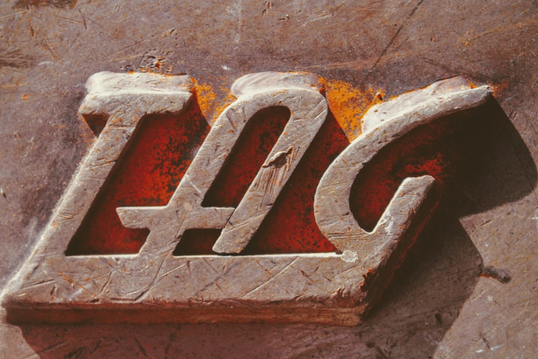
Going retro with serif fonts and weathered textures can offer uniqueness and old-school trustworthiness. Especially relevant for traditional coaching niches or consultants targeting legacy businesses.
Why it works: Nostalgic, trustworthy, and distinctive when everyone else is using sleek sans-serif fonts.

11. Color as Identity
While not a graphic style, using a distinct and consistent color palette as a core logo feature is a solid design strategy. A specific shade of teal, gold, or charcoal can become synonymous with your brand across every touchpoint.
Why it works: Enhances recognition and emotional connection. Consistent use of color can become just as iconic as a shape.
Putting It All Together
A strong logo should align with your brand identity, values, and the audience you serve. Whether you lean toward minimalism, symbolism, or vivid graphics, your logo should be timeless yet future-proof. It should look just as good on a Zoom backdrop as it does on a conference banner or book cover.
Don’t hesitate to test variations, get feedback, and even collaborate with a professional designer who understands the nuances of personal branding. Ultimately, your logo is an ever-present touchstone for your brand’s credibility and charisma.
FAQ
-
Q: How do I know which logo style is right for my coaching or consulting brand?
A: Consider your brand personality, the values you want to communicate, and your target audience. A wellness coach may benefit from a nature-inspired logo, while a strategic consultant might opt for a geometric design. -
Q: Should I hire a professional designer or use a logo generator?
A: If budget allows, hiring a designer helps ensure a custom, meaningful result. Logo generators can be a good starting point for inspiration but may produce generic results. -
Q: Can I change my logo later as my brand evolves?
A: Absolutely. Brands evolve, and many companies refresh their logos to stay relevant or reflect a shift in focus. Just make sure the change is intentional and rolled out consistently. -
Q: What file formats should my logo be in?
A: You should have your logo in high-resolution formats like PNG, JPEG, and especially SVG for scalability. Having both color and black-and-white versions is also recommended. -
Q: How important is color psychology in logo design?
A: Very important. Different colors evoke different emotions and associations. Blue often conveys trust, green implies growth, and gold signals prestige or high value.
Finding the right visual identity is a journey. With the right logo, your brand won’t just be seen—it’ll be remembered.
