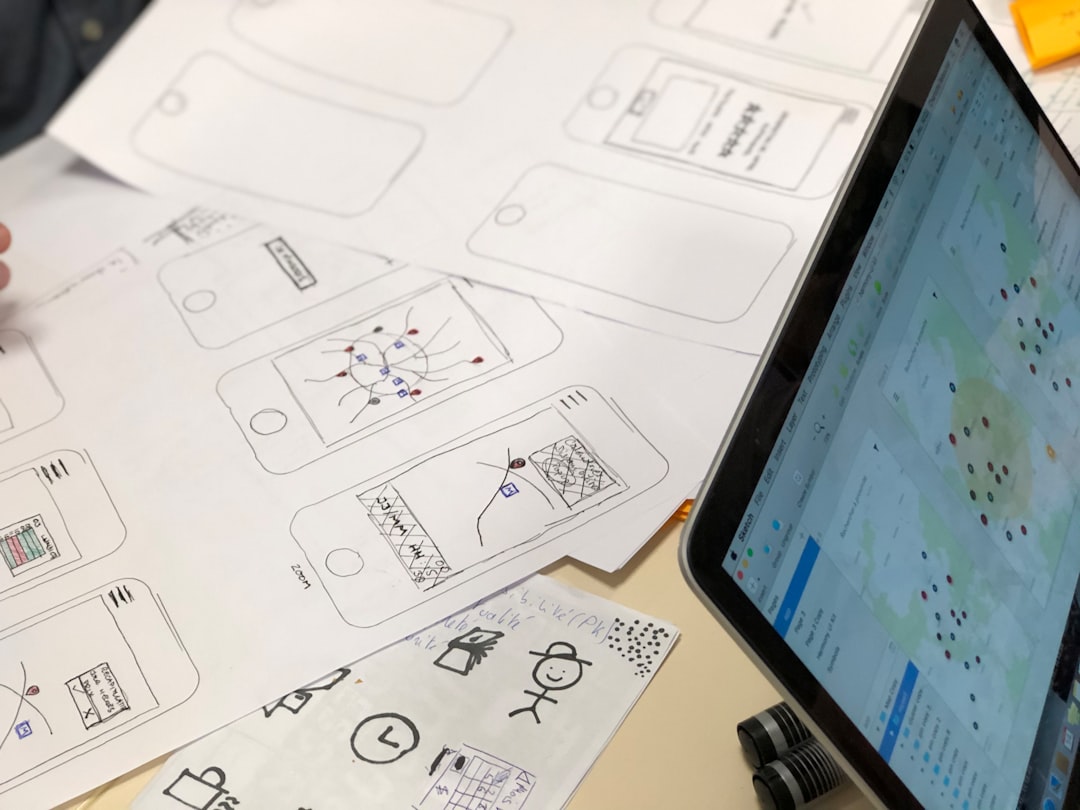
In a world where visuals matter more than ever, bookstores and independent publishers must stand out with compelling branding. At the heart of this branding lies the logo — a symbol that conveys a store’s character, vision, and relationship with the literary world. Whether it’s a quaint corner bookstore or a niche small press, the right logo can help build recognition and trust, drawing customers into stories, both new and timeless.
TL;DR:
Bookstores and independent publishers benefit greatly from strong visual identities, with logos playing a key role. This article explores 12 creative logo design ideas tailored to their unique industry presence. From vintage motifs to modern minimalist symbols, every suggestion is aimed at evoking literary charm and brand recognition. FAQs at the end shed light on the design process and practical considerations.
12 Logo Ideas for Bookstores and Independent Publishers
Here are twelve creative and inspiring logo ideas that can help bookstores and independent publishers establish a memorable and professional brand.
-
1. Open Book Silhouettes
An open book is a universally recognized symbol associated with learning, storytelling, and adventure. A clean, stylized silhouette of a book in mid-flip can communicate approachability and warmth. Use soft serif fonts alongside the symbol to add a classic feel or go with minimalist slants for a more modern approach.
-
2. Quill Pen and Inkpot
This classic imagery resonates well with literature lovers. The quill pen invokes ideas of timeless storytelling and craftsmanship. Pairing it with a rich color palette like deep blues, burgundies, or golds enhances the elegance and legacy of your brand.
-
3. Bookshelf Geometrics
Imagine forming an abstract logo using geometric lines to represent stacked books on a shelf. This offers a modern and organized look, perfect for publishers who want to project professionalism and structure.

-
4. Literary Creature Mascots
Create a mascot logo using an imaginative animal or mythical creature holding or reading a book. Owls, foxes, or even dragons can symbolize intelligence and creativity while providing a friendly and whimsical brand identity, especially for children’s bookstores.
-
5. Vintage Typewriter Inspiration
Evoking the nostalgia of the writing process, a typewriter-style font or a graphic resembling a classic typewriter key can give off a retro and thoughtful vibe. Best suited for publishers who honor the literary traditions of the past.
-
6. Monograms with a Twist
If you’re looking for minimalism but still want uniqueness, a cleverly designed monogram logo using the company’s initials can be subtle yet effective. Incorporate book edges or punctuation marks like quotation marks to echo literary themes.
-
7. Bookmark Symbolism
A stylized bookmark can be a sleek, vertical logo that represents saving important moments in literature. This symbol communicates attention to detail, ideal for curated or niche book collections and boutique publishers.
-
8. Typography-Centric Logos
Sometimes, words can be images too. Creative use of fonts, kerning, and spacing can form expressive logos. Choose classic serif fonts for literary gravitas or clean sans-serif for a modern indie aesthetic. Some designers manipulate letters to resemble spines or pages.
-
9. Celestial and Star Motifs
For fantasy or philosophy-focused publishers, incorporating symbols like moons, stars, and constellations can add a whimsical or metaphysical tone. Pair these with darker tones like midnight blue for a dreamy feel.

-
10. Paper and Scroll Logos
Scrolls and rolled-up parchment convey a sense of historic significance and wisdom. Useful for publishers with academic or historical catalogs, this logo concept highlights tradition and authority in printed knowledge.
-
11. Hidden Symbols in Negative Space
Negative space can be cleverly used to embed books, pens, quotation marks, or even hidden characters into a logo. This style appeals to design-savvy audiences and adds an element of discovery to the brand.
-
12. Hand-Drawn Sketch Styles
To reflect the personal, independent, and artisanal nature of a small press or local bookstore, consider a logo that looks hand-sketched. It offers authenticity and a creative personality, standing out in a sea of corporate polish.
Tips When Designing Your Logo
- Know your niche: A children’s bookstore may benefit from playful designs, while an academic publisher may desire a formal, timeless logo.
- Simplicity wins: Complex graphics may look fantastic in large formats but lose clarity when shrunk. Always test your logo’s scalability.
- Avoid trends: While it’s good to be aware of design trends, the goal is longevity. A logo should still feel relevant in ten years.
- Use vector files: Ensure you receive your logo in a vector format (like SVG, AI, or EPS) so it can scale without losing quality.
Closing Thoughts
Creating a memorable logo for a bookstore or independent publishing house is a critical part of establishing brand identity. The right logo does more than look good — it tells your story before a customer reads a single page. Whether you’re conveying timeless knowledge, fantasy adventures, or modern literary innovation, selecting the right symbols, typography, and style makes all the difference.
FAQs
- How do I choose the right color palette for a book-related logo?
- Colors should reflect your brand tone. Earthy tones and dark greens can create a cozy, scholarly feel. Bright colors are great for targeting younger audiences, while black and gold evoke traditional elegance.
- Should my bookstore logo include text or just a symbol?
- That depends on your brand awareness. New businesses may benefit from incorporating their name with the design. Established brands can rely on symbols alone once recognition is strong.
- Is it worth hiring a professional designer?
- Yes, especially if design isn’t your strength. Professional designers bring visual strategy, a deep understanding of branding, and technical skills that ensure your logo works across all mediums.
- Can I redesign an existing logo safely?
- Absolutely. Logo evolution is common. Just make sure the redesign retains some visual aspects to maintain continuity if customer recognition is already established.
- What file types should I ask for after the design is complete?
- Request vector formats like SVG, AI, or EPS for print and high-resolution usage. PNG or JPG formats are suitable for web use, but don’t scale as well.
