Logos are often the first visual impression a customer has of your brand. For bookstores and independent publishers, a carefully crafted logo can reflect your story, character, and mission in a glance. Whether you’re launching a quaint corner bookstore or a bold indie publishing house, the right logo can set the tone for your entire brand identity.
TLDR:
Choosing the right logo for your bookstore or publishing company can influence how readers perceive your business. From minimalist symbols to vintage emblems, there’s a wide range of design options to explore. This article outlines 12 creative ideas for logos that are perfect for book-centric brands. Each is tailored to help independent booksellers and publishers stand out and make lasting impressions.
1. Open Book Icon
An open book motif is timeless and immediately signals literature. It appeals to nostalgia and simplicity. This concept works especially well with clean lines and a modern serif or sans-serif font accompanying the image. It’s great for conveying accessibility, storytelling, and openness.
Design Tip: Consider stylizing the open pages into a symbolic shape like a heart or wings for extra personality.
2. Typewriter Typography
Play with vintage typewriter fonts and imagery to evoke a literary history that resonates with older and younger readers alike. This is especially ideal for independent publishers who emphasize craftsmanship and the written word.
Best For: Publications that specialize in historical fiction, literary essays, or poetry.
3. Bookshelf Silhouette
A minimalistic or detailed bookshelf can evoke feelings of coziness and curiosity. Whether you go for tightly packed tomes or an abstract alignment of spines, a bookshelf logo can reveal a lot about your brand tone—casual, intellectual, or even playful.

4. Quill and Ink
A classic motif for publishers, the quill represents writing as an art form. Incorporating a feather quill and an ink bottle provides immediate connections to originality, history, and the craft of storytelling.
Visual Twist: Modernize this idea by making the feather sleek or minimal and pairing it with a bold, geometric font.
5. Abstract Page Turns
Use stylized curves or layered shapes to simulate the turning of a page. This iconography suggests movement, progress, and narrative flow — key elements for dynamic brands aiming to innovate in literary space.
Appeal Factor: Great for brands that focus on digital publishing or younger audiences.
6. Ink Splash or Spill
An ink splash or spill can symbolize both creativity and unpredictability — hallmarks of many indie publishers. This concept brings energy and spontaneity to your logo, making it memorable and unique.
Use With: Bold colors or gradients to stand out even more.
7. Tree of Knowledge
This emblem mixes tradition and metaphor, linking books to growth and roots. Ideal for bookstores that emphasize education or cultural heritage, a tree bearing books or pages as leaves is symbolic and visually rich.

8. Minimalist Monogram
Using the initials of your store or company in a sleek monogram creates a timeless and elegant look. This style works well in both black and white or paired with classic muted tones like navy, forest green, or burgundy.
Perfect For: High-end literary brands or boutique publishers focused on limited editions.
9. Book and Coffee Combo
If your bookstore also houses a café, combine coffee and books in a clever visual. A steaming cup that morphs into an open book or a saucer shaped like a page is fun and inviting. This dual-purpose logo suggests a welcoming, community-building atmosphere.
Audience: Millennials, students, and travelers who love to linger over lattes and literature.
10. Doorway or Portal Motif
Design a logo using a doorway or portal visual — metaphorical of entering new worlds through reading. This aligns beautifully with fantasy, speculative fiction, or cultural narratives that transport readers elsewhere.
Creative Element: Frame the doorway with book spines or scripts to enhance the literary concept.
11. Vintage Seal or Stamp
Give your logo a traditional publisher’s mark with a circular or rectangular seal, complete with custom typography and ornamental borders. These evoke quality, legacy, and formality — traits that appeal to discerning readers and collectors.
Pro Tip: Use embossing or foil stamping techniques on print materials to highlight the design’s tactile value.
12. Animal Mascot with a Literary Twist
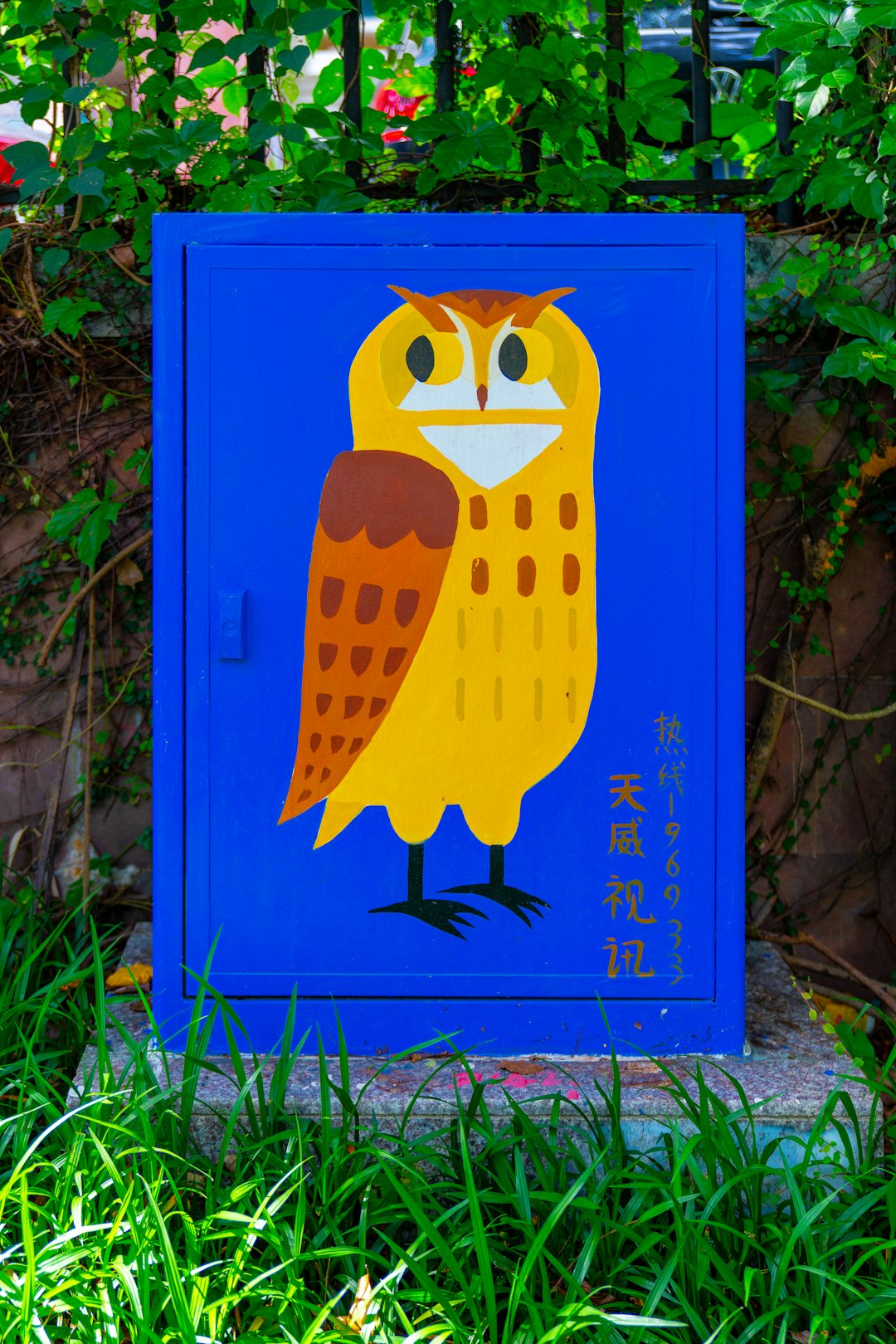
Consider adopting an animal mascot reading or holding a book. Owls, foxes, cats, and even dragons can be adapted into playful or wise brand representations. This style helps give your brand a face and personality, especially if you target children or families.

Final Thoughts: Designing With Intent
The most effective logos are not just good-looking—they tell a story. Whether you lean into nostalgia with a typewriter image or go modern with an abstract monogram, your bookstore or publishing logo should reflect your values and connect with your audience. Don’t be afraid to experiment with combinations such as symbols and words, or traditional and contemporary elements.
Also, ensure that your logo works in both digital and print formats, especially if you’re planning on publishing books, newsletters, or promotional materials. Scalability, simplicity, and color versatility are key factors to consider during design.
Tips for Working with Designers
- Communicate Your Brand Story: Share your origin, target audience, and book genres to help the designer understand your identity.
- Provide Visual Inspiration: Create a mood board with logos, colors, and fonts you love.
- Ask for Multiple Versions: Request horizontal, vertical, and icon-only versions of your logo for flexibility.
- Keep It Timeless: Avoid trends that may look dated in a few years unless they align perfectly with your niche.
Conclusion
From open books and quills to abstract symbols and whimsical mascots, the possibilities for bookstore and indie publisher logos are just as diverse and creative as literature itself. Investing time into a meaningful logo sets the foundation for brand loyalty, recognizability, and emotional connection—qualities that every successful literary brand should aim for.
Let your logo speak volumes before anyone even turns a page.
