Whether you’re a graphic designer, a budding entrepreneur, or just someone with a creative streak, selling custom-printed T-shirts, tote bags, and hoodies online through print-on-demand (POD) platforms has never been easier—or more popular. Among the many components that contribute to a successful POD business, your logo design might be the most important. Your logo isn’t just your brand’s visual mark; it’s an essential part of the product itself, appearing prominently on fabric items that people will wear and carry in public.
TLDR: Why Logos Matter in Print on Demand
Logos serve as your brand’s identity on apparel and accessories, setting your work apart from the competition. A well-designed logo can turn a regular hoodie or tote into a statement piece. Strategic logo placement and smart use of colors are crucial for visual impact and brand recognition. Investing time into creating a versatile, scalable logo will pay off in both aesthetics and sales.
Why Logos Are Crucial for POD Success
In the bustling world of print-on-demand, your products compete with thousands of others. While quality and originality are important, having a recognizable and striking logo can dramatically increase your chances of success. Here’s why:
- Brand Identity: A logo tells customers who you are in a second. It communicates your tone, style, and core message.
- Visual Recognition: When someone wears a T-shirt with your logo or carries your branded tote, they’re promoting your business every time they step out.
- Trust and Professionalism: A professionally designed logo lends credibility and can make your POD store appear more trustworthy and established.
Designing the Right Logo for Fabric
Textiles are a unique canvas. A logo that looks amazing on a digital screen may not translate well onto cloth, especially with different fabrics and printing methods. Here are a few things to keep in mind:
1. Simplicity Works Best
Busy or overly intricate logos lose their impact on fabric. Fine details might bleed or become illegible after a few washes. Stick to clean lines, bold shapes, and readable text.
2. Color Contrast Is Key
Your artwork needs to stand out. High contrast between your logo and the garment color is essential. For example, a white or neon logo pops on a black hoodie, while darker logos pair well with light-colored totes.
3. Scalable for Different Sizes
Your logo might appear on a small chest area of a T-shirt or be stretched across the side of a tote bag. Make sure your design remains legible in both small and large sizes.
4. Avoid Gradients and Very Fine Lines
While these work well in digital formats, gradients and delicate lines can look blotchy or faded when printed onto fabric, especially when using screen printing or thermal transfer methods.
Best Logo Types for POD Products
Not all logo styles are created equal when it comes to POD. Here are some popular types of logos and how they fare on items like T-shirts, totes, and hoodies:
- Wordmarks: These use only text—think Google or Coca-Cola. They’re an excellent choice for minimalist fashion, especially when done in a stylish or custom typeface.
- Lettermarks: Monograms like IBM or HBO. These concise identifiers work beautifully for sleek designs that need to be discreet, especially on small items like a tote bag’s corner.
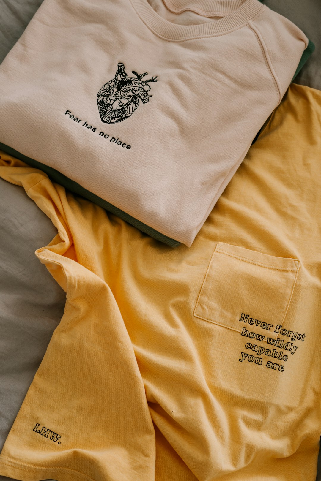
- Symbol or Icon Logos: This includes visuals like the Apple logo or Twitter’s bird. These work well on hats, chest areas, or as pocket-sized embellishments on hoodies.
- Combination Marks: The best of both worlds—text and icon. Ideal for the front or back of T-shirts and hoodies, giving people clarity and aesthetic appeal in one glance.
Placement Considerations Per Item
T-Shirts
The classic chest area is great for small logos or wordmarks, while the back offers more real estate for full designs. Side prints and bottom corners are trendy and unconventional placements that work especially well for streetwear aesthetics.
Hoodies
Hoodies offer multiple opportunities: the chest, back, and even the sleeves or the hoodie pouch. You’ll want to consider how your logo interacts with folds and seams—bold and symmetric logos tend to look best here.
Tote Bags
The large flat space of a tote is like a canvas. Centered logos can be bold statements, while corner placements offer a subtle and modern touch. Some designers experiment with vertical branding along the edge for a fresh look.
Choosing the Right Colors and Fonts
Color and typography don’t just affect aesthetics—they directly influence the legibility and character of your logo.
Color Tips
- Use PMS or Pantone colors: These provide consistency across different print batches.
- Limit your palette: Keep to 2–3 colors to reduce printing costs and avoid visual clutter.
- Contrast matters: Make sure your logo is visible on both dark and light backgrounds, or create alternate versions in white or black to ensure flexibility.
Font Tips
- Sans-serif fonts: These are generally easier to read at smaller sizes, especially in casual fashion contexts.
- Custom typography: A unique font or a hand-drawn feel can make your brand instantly recognizable.
- Font weight: Go for bold or medium weights to maintain legibility on fabric.
Mockups and Testing Your Logo
Before launching your designs into the POD marketplace, preview them on real product mockups. These can give you a much clearer idea of how the logos will look on actual fabric. Many POD platforms offer built-in mockup generators that simulate real-life printing.
Alternatively, order a sample product to see how your logo performs in the real world. This is the ultimate quality check—look out for clarity, color accuracy, and alignment.
Common Mistakes to Avoid
- Too much detail: Overly complex designs can blur or become unrecognizable after a few washes.
- Wrong colors for fabric: Colors may look different on your screen versus printed cloth. Test thoroughly.
- Poor scalability: Always ensure your logo works in both small and large formats.
- Ignoring brand coherence: Your logo design should align with the rest of your brand voice, from your website to your social media and product packaging.
Final Thoughts: Building a Wearable Brand Identity
Designing logos for print-on-demand is both an artistic and strategic process. Remember, you’re not just creating a symbol—you’re crafting a visual identity that people will wear, flaunt, and share. A logo that’s visually compelling and functionally sound can turn a simple hoodie into a wardrobe favorite or a tote into a walking billboard. Take your time with the process, test it thoroughly, and most importantly, make it meaningful.
With thoughtful design and smart placement, your logo can transform garments into trendsetting statements and elevate your brand from a digital storefront to a streetwise fashion staple.