In the world of digital design, contrast is king. It guides the user’s eye, creates hierarchy, and ensures readability. Among the many color combinations a designer might choose from, one of the most striking—and surprisingly effective—is the pairing of dark backgrounds with yellow accents. This high-contrast duo isn’t just visually compelling; it can enhance accessibility and brand recognition when used thoughtfully.
TLDR (Too Long, Didn’t Read)
Designing with dark and yellow color schemes offers striking visual contrast that can improve readability, catch attention, and create a bold brand identity. However, this style must be used with care to balance aesthetic appeal and accessibility. Tips include moderating brightness, maintaining enough white space, and choosing the right font weights. This article walks you through expert tips, common pitfalls, and powerful examples for creating high-contrast designs that stand out while still being user-friendly.
Why Choose Dark and Yellow?
There’s a psychological and practical appeal to this combination. Yellow naturally grabs attention—it’s the color of warning signs and highlighters. Dark backgrounds create a dramatic canvas that lets other elements ‘pop.’ Together, they form a harmonious contrast that stimulates the eye and quickly delivers information.
- Attention-Grabbing: Yellow elements on dark backgrounds act like visual magnets.
- High Readability: When used correctly, this combo enhances text and icon legibility.
- Memorable Branding: The contrast is often associated with innovation and boldness.
1. Start with the Right Shades
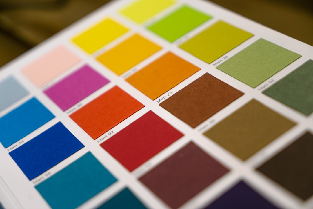
Not all yellows (or darks) are made equal. The key is choosing the right shades to avoid eye strain or poor contrast ratios. A neon yellow on jet black can be too harsh, while a pale yellow on dark gray may be too dim to stand out.
- Yellow Tips: Try goldenrod, sunflower, or mustard for a warm and stable feel.
- Dark Backgrounds: Opt for charcoal, navy, or deep plum instead of just pure black.
Use a color contrast tool (like the WebAIM Contrast Checker) to ensure your text meets WCAG guidelines for readability, especially on buttons and body text.
2. Understand Usage and Hierarchy
One of the smartest ways to use a high-contrast combo is to create a visual hierarchy. Use dark backgrounds as a canvas, and let yellow guide the user’s attention. But moderation is key—overusing yellow can make your design feel chaotic or cheap.
Here’s a rule of thumb:
Use yellow sparingly and with purpose, such as for calls to action (CTAs), highlights, or navigation aids.
Structure your hierarchy like this:
- Headlines and Important Labels: Consider using yellow here for quick recognizability.
- Supporting Text: Keep it neutral (light grey or white) to avoid visual overload.
- Backgrounds and Containers: Keep dark tones uniform for consistency.
3. Typography and Readability
Typography plays a huge role when working with high-contrast backgrounds. Light fonts on dark backgrounds can feel crisp, but also cause eye strain over long reading periods. That’s why employing smart font choices is essential.
- Font Weight: Go with medium to bold weights; light fonts may disappear into the background.
- Size Matters: Keep text large enough—16px minimum—for comfortable reading on screens.
- Line Height: Increase line spacing slightly for better clarity on dark canvases.
And if you’re using yellow text, restrict it to headers or short, impactful lines only. Never use yellow for dense paragraph copy.
4. Let White Space Breathe
When working with stark color contrasts, layouts can quickly feel dense or overwhelming. Adding adequate white (or more accurately, negative) space ensures your design elements are digestible and not fighting for attention.
White space enhances:
- Focus: It directs attention to what matters most.
- Clarity: It separates elements and prevents visual clutter.
- Luxury Feel: It can turn bold, aggressive color schemes into something elegant.
5. Test in Different Lighting Conditions
Remember: not everyone views your website or app in a dark room. High-contrast designs can perform wildly differently depending on ambient light. Test your design on multiple devices, under varying brightness settings, to ensure it holds up.
Consider offering a light mode version for users who find the dark-and-yellow theme too intense under certain conditions. Flexibility shows that you prioritize user experience.
6. Accessibility Isn’t Optional
Design is for everyone—including users with color blindness, low vision, or sensory processing challenges. Yellow can be especially problematic for users with light sensitivity or specific types of color vision deficiencies.
Follow these accessibility best practices:
- Ensure foreground/background contrast ratios meet AA or AAA standards
- Avoid purely color-based cues—use icons or underlines for links and buttons
- Allow users to toggle between themes if possible
Tools like WebAIM and the Color Oracle simulator can elevate your inclusivity game by helping you test designs from multiple accessibility perspectives.
7. Use Intentional Motion
Motion design can further enhance a high-contrast color palette’s impact. Animations using yellow elements (like pulse effects on a CTA) draw instant attention without being jarring—as long as they are smooth and purposeful.
- Microinteractions: Subtle hover effects on buttons or active states in navigation are great places to integrate yellow motion.
- Loaders and Transitions: Frame loading animations in yellow to create a lively, engaging vibe.
Just remember: motion should support, not distract.
Examples in the Wild
Many brands use dark and yellow to great effect. Think of National Geographic with its iconic yellow border on a black or dark gray backdrop. Or Batman’s logo, which finds instant recognition through its high-contrast simplicity.
Other great use cases:
- Tech startups: Dark yellow designs feel innovative and bold
- Gaming platforms: The combo evokes energy and urgency
- Industrial brands: Yellow is often associated with caution and construction
Common Mistakes to Avoid
Even the most stunning combinations can go wrong. Here are a few common pitfalls:
- Too much yellow: When everything is a highlight, nothing stands out.
- Ignoring accessibility: Don’t assume everyone sees yellow the same.
- Clashing tones: Mismatched shades can kill the vibe—test before going live.
Final Thoughts
Dark and yellow isn’t a gimmick—it’s a loud, proud design choice that, when done well, delivers high impact and strong usability. The trick lies in restraint, contrast balance, and attentive detail. If you’re aiming for readability, drama, and modern flair, this power duo might be exactly what your next design needs.
Combine creativity with responsibility, test thoroughly, and always prioritize accessibility alongside aesthetics. High contrast designs don’t just look good—they work, too.