Designing a double-sided brochure is a strategic task that blends visual appeal with effective communication. One of the most critical elements in achieving that balance is color. The best color combinations not only capture attention but also ensure that the brochure remains readable, professional, and aligned with the brand or message. Whether you’re promoting a service, announcing an event, or selling a product, choosing the right colors can make your brochure stand out in a crowded marketplace.
Importance of Color in Brochure Design
Colors influence how readers perceive the content and even their mood while interacting with the materials. Whether aiming for a bold, energetic look or a calm, professional vibe, different color palettes evoke different reactions. The selection for double-sided brochures must reflect this understanding while ensuring contrast and consistency on both sides for optimal legibility and user engagement.
Top Color Combinations for Double-Sided Brochures
Here are some of the most effective color pairings that work well on double-sided print designs:
- Blue and White: This classic combination exudes professionalism and trust. Blue tones (from navy to sky blue) paired with white can make content easily digestible and calm.
- Black and Gold: Perfect for luxury brands, black and gold offer a sophisticated, elegant look. Use this when appealing to upscale markets or for formal events.
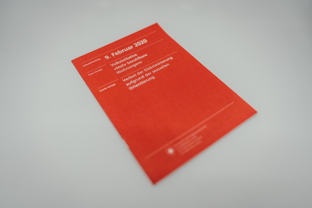
- Red and Grey: The energy and urgency of red balances well with neutral grey. This dynamic mix is great for marketing promotions or product launches.
- Green and Beige: Ideal for eco-friendly or wellness-oriented businesses, this earthy combo is soothing yet fresh.
- Purple and Silver: A somewhat unconventional but eye-catching pairing, purple and silver convey creativity and modern elegance.
Design Tips for Double-Sided Color Consistency
When working with two sides, it’s vital to maintain harmony while making each side serve its own communicative purpose. Here are a few tips:
- Maintain a unified color scheme: Ensure both sides use a consistent base palette to provide visual continuity that helps the reader navigate the brochure.
- Use color to create hierarchy: Highlight headlines with a bolder tone while leaving body text in neutral colors for clarity.
- Mind your margins and folds: When folded, sides become connected; ensure overlapping edges use complementary shades to avoid harsh clashing.
Color Psychology and Its Role in Brochure Design
Color psychology plays an important role in how a customer emotionally connects with your message. Color choices should strategically align with the brochure’s purpose.
- Blue: Creates a sense of security and trust. Commonly used in finance, healthcare, and tech industries.
- Red: Evokes excitement and urgency. Ideal for sales-focused materials.
- Green: Represents health, nature, and tranquility. A good fit for organic brands and wellness centers.
- Orange: Energetic and playful, often used in entertainment or children’s products.
- Black: Sophistication and luxury. Elements in black suit premium or fashion-focused brands.
Contrast and Readability
Readability should always be prioritized. Light backgrounds with dark text (and vice versa) ensure clarity. Colors like white, cream, or light grey make excellent backgrounds, especially for dense content sections. Avoid using overly bright or neon colors that strain the eyes or distract from the core message.
FAQ
- Q: Can I use a different color theme on each side of the brochure?
A: Yes, but ensure they are related or complementary. Disjointed color themes can make your design look inconsistent and confuse the reader. - Q: What software should I use to manage colors effectively?
A: Tools like Adobe InDesign or Illustrator are ideal for full control over color palettes, contrasted layers, and professional printing options. - Q: Which color combinations are best avoided?
A: Avoid clashing colors like red and green (can be difficult for color-blind viewers), and low-contrast combinations such as yellow on white or blue on black for body text. - Q: How do I choose colors that align with my brand?
A: Start with your brand’s existing guidelines. If none exist, refer to your brand’s personality—bold, trustworthy, playful—and pick colors that evoke similar traits. - Q: Does printing quality affect color appearance?
A: Absolutely. Always test print your design and consult with your printer about color calibration and paper type to ensure color accuracy.